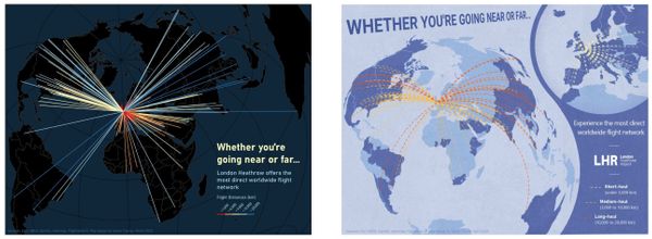
Flight Advertisement Map Revisions
For my final project in GEOG 486, Cartography and Visualization, I chose to revise an earlier assignment, which had the following objectives:
- Create three advertisements for London Heathrow Airport (LHR) using flight origin-destination data.
- Select and customize map projections based on each map’s purpose and overall design.
- Use appropriate visual variables to symbolize background data and flowlines.
- Create well-designed layouts with appropriate legends and text elements.
The first time I designed these maps I didn’t keep a consistent audience in mind. Initial maps symbolized excessive information, and the chosen color scheme did not support the maps’ intended purpose. During redesigning the maps, my approach focused on simplifying map symbolization and making sure my color schemes made sense for the data being portrayed.
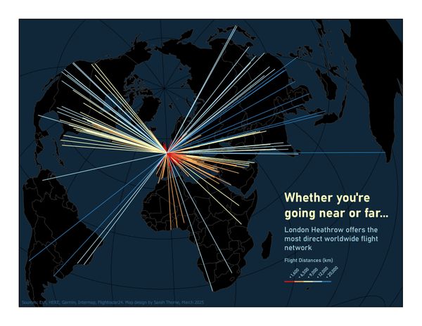
Original design
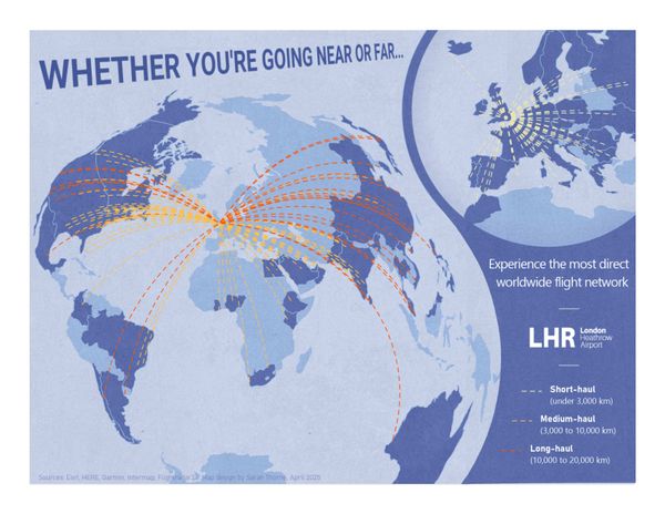
Revised design
One of the trade-offs made during redesigning my maps was choosing coordinate projections for the purpose of creating a compelling advertisement rather than for their individual properties. I spent more time during the redesign looking at how the resulting map of different projections could be formatted into an advertisement instead of reading projection descriptions and choosing which one may have the least data distortion. The other trade-off I made was simplifying the number of classes portrayed over displaying data in detail. I knew I needed to replace divergent color schemes with a sequential, and I found that having more than three classes in a sequential color scheme gave the maps a more scientific intention than I wanted. I decided a maximum of three classes provided enough information to the audience and best supported the purpose of the advertisement.
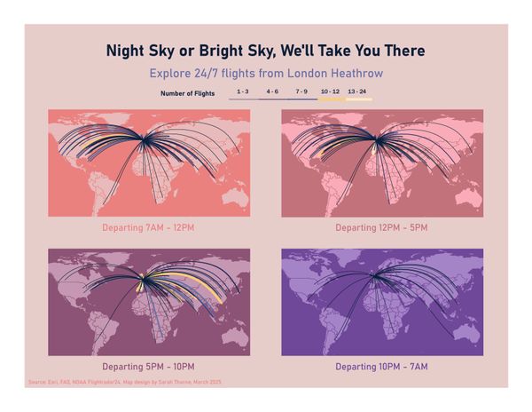
Original design
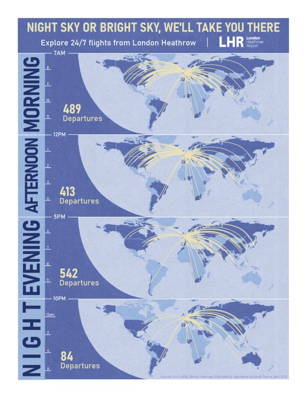
Revised design
I originally used a divergent color scheme in an attempt to increase contrast between the five classes of data I wanted to display. During my revision, I revisited the design question of “how much time will a reader spend with your map?”, as well as readings on “how to lie with maps” and the different design intentions behind diverging and sequential color schemes. Reviewing this material helped remind me that the point of these advertisements was to appeal to the average traveler and the company paying for the advertisements alike. Utilizing five data classes and a diverging color scheme likely did not help catch a reader’s eye or further achieve the company’s goal of selling more tickets - this approach likely appeals more to someone performing analysis on LHR flights.
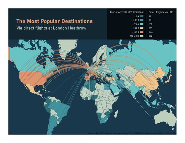
Original design
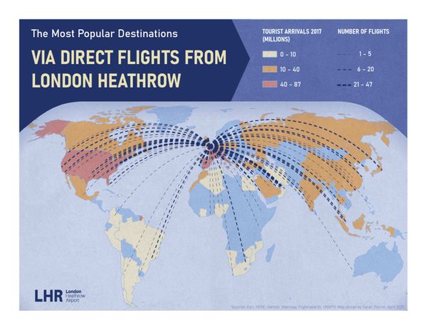
Revised design
Additionally, I originally didn’t put enough thought into how to apply visual hierarchy specific to ad materials. For the redesign, I wanted to push myself to incorporate the provided data into an ad campaign one might see in an airport magazine. This is also where I believe I would make further improvements if I had more time designing these maps. I think it would be fun to explore beyond projections within ArcGIS Pro and experiment with different design software (i.e. Illustrator/InDesign) to see what other creative ways I could visualize flight path data and create a more cohesive ad campaign.